Image Based Lighting

What this Guide is and is not
Before we begin I'd like to take the time to explain what this guide is about. This guide will not go into full depth about each individual settings and options are in IBL. I myself don't know what certain settings do as I am not a 3D programmer. I know enough to play around and tune the settings to get the picture that I want and that's what I'll be demonstrating here.
I will be showing you how I set up my scenes, step by step. This is not the right or wrong way to do it and certainly not the only way to do it but simply how I do it.
Getting Started

Click on the image to download the scene file
Just so everyone is on the same page, I am using the default LRE settings which means default curves. If you are using a custom curve your image will look different from mine.
Depending on the scene in my head I will start with either setting up the map first or the characters first.
In this example scene I started with the background and located a spot I wished to shoot from and loaded my character and finally posed her.
For the purpose of this tutorial I will be sharing the scene file so you can follow along. Click on the image to the left to download.

1

2
Turn it off
1. These are my settings for starting a new scene. Go to System > Camera Light and turn everything off and bring Base Reflection: Intensity to 0. The default lights don't allow for much control and I prefer to use the lighting items in the Add > Light menu.
2. Hit F5 to bring up the IBL menu and this menu will pop up. This is where I'll choose my cubemap, depending on the scene I'll choose the one that matches the lighting or has the lighting that I want for my scene. For this tutorial we will be using Abandoned Sanatorium 1.
The Skybox is set to default but we will tweak it to adjust the ambient light of the scene. Reflection is also turned off because I don't like the look it gives to the characters with it turned on. You can have it on thought, that's up to you.

3. In the lens tab I usually keep everything off but sometimes I'll turn the vignette on and very rarely will I turn Chromatic Aberration on simple because it simulates the look of a cheap camera lens, and here at the school of sin we are all about the picture quality. But if you like it, you can turn it on.
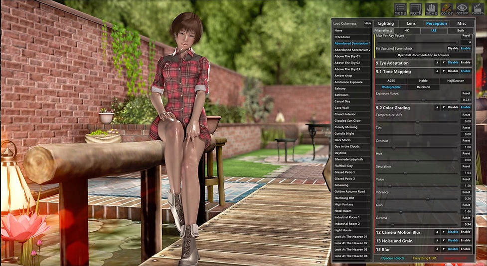
4. Perception Tab. This is truly where the magic happens. I usually keep everything off at the very beginning except Tone Mapping and Color Grading as shown above.

We will revisit this tab once our scene is more put together since we will be constantly adjusting light settings and all settings in IBL, specifically the settings in Perception tab.
3
4
Lighting it up
As you may notice with everything turned off it will look dark and lifeless but we'll fix that right now by adding in the lights for the scene.
For outdoor scenes I like to use an Overall Light for the Main Light. If you don't know where it is head to Add > Light > Overall Light (All). There are also Overall Light Character Only and Map Only if you want even more control but most of the time Overall Light does what I need it to do. Once you spawned a light enter the following coordinates to mirror my setup:
Move X: -0.126 Y: 0.644 Z: 4.807
Rotate X: 21.551 Y: 140.261
Now that it's in position head to your color picker and enter the following values shown in the screenshot below and I also recommend you save it as a preset for future outdoor scenes. Since the sun is not perfectly white but a slightly orange tone we'll have to adjust the color accordingly if we want a realistic looking shot.

Now add a Over all Light (Character Only), we will be using this as a fill light.
*NOTE* Character Only works with actual maps and not map items, though there are a few exceptions. If used on a map item the item will also light up so be careful.
If you haven't already create a folder called Lights, followed by two more folders called Main Light and Fill light. Place the Overall Light (All) into main light folder and (Chara Only) into the Fill Light as shown in the workspace below.
Once that's done set your coordinates as follows:
Rotate X: 5.364 Y: 88.291
The placement is not as important as the light is the same no matter where you move it, but you might want to move it if it's blocking your scene.

What did we learn about lighting in the Lighting section? We learned that light bounces off of surfaces and objects. Different objects will reflect more light than others.
We will be adding lights to the water on her right to simulate light bouncing off the water. Light bouncing off water is usually quite bright so we need to spawn a Spotlight All (All because it will be affecting the model and the objects around her) turn up the Strength and reduce the shadow strength or remove shadows entirely and put in the following coordinates.
Note: Location of Spotlight is important and will affect the angle of the light .
Move X: 1.429 Y: -0.976 Z: -0.101
Rotate X: 315.310 Y: 258.924
I zoomed out the shot to give you a better idea of the placement of the spotlight.

Next we'll be adding rim lights to create separation of the subject and the background.
Spawn a Spotlight Character, set strength to 1.46, spot Angle at 67, leave shadows on for less light spill and set the coordinates to:
Move X:0.241 Y: 0.791 Z: -1.436
Rotate X: 24.053 Y: 18.123
Duplicate (CTRL + D) the spotlight and set the second spotlight to:
Move X:1.100 Y: 0.791 Z: -0.981
Rotate X: 24.053 Y: 327.831
If you don't like shadows or if it looks too strong you can turn it off or turn down the shadow strength to your liking.

Perception Tab
Now that we have a basic lighting setup we can start tuning the image to make it pop. So let's open up IBL and start tweaking the settings.
We'll skip the Lighting and Lens tab for this scene as there isn't much that's needed to be adjusted. Most if not all of the settings on this tab is purely preference, there is no right or wrong way to tweak your image and the settings here are what I like. You can choose to change these settings for yourself if you are not satisfied with your image.
Also there is no correct order to tune these settings, if you wish to set up of field first, or bloom first you may do so. I'm simply going down the list so it's easier to follow along
SSAO
For SSAO I don't like having too dark or strong of edges so I keep radius fairly low just enough to make the subject pop

Space Screen Reflections
We'll skip this one for this tutorial. I only use this when there are a lot of reflective surfaces but there aren't any on this map. It also gives a weird reflection to the skin which I don't find flattering so most of the time I'll keep it off
Depth of Field
Depth of Field is a powerful tool which will make your photos look professional and realistic. The point of depth of field is to draw attention to your subject.
When using DoF I recommend you turning on Visualize Focus to see what will be affected by the blur. Everything in white will blur while everything in black will be in focus. Play around wit Focal Size and Aperture to get different degrees of DoF. If you are looking for precise DoF use the Aperture to get razor sharp focus.
Max Blur Distance will increase or decrease the strength of the blur.
Near blur will adjust the blur of objects that are blurred in the foreground. In this demo there are no blurred objects in front so we can leave it off or leave it on but it won't affect anything.
Blur Type
Blur type here will change the look of the bokeh. Bokeh is the blurry or out of focus part of your photo. The main difference between these two settings is the shape of the bokeh, DiscBlur being circular and DX11 being a hexagon shape. The look you prefer is entirely up to you. Look at the screens below to see the difference in blur shapes.

DX11 has a hexagon shape to its blur. I exaggerated the effect to make it more visible

Sun Shafts
The sun shaft feature will simulate god rays from the scene if the light source allows it. This occurs when there's a brightly lit object in the scene. If you'd like to use this I would suggest getting a background that is very bright and sunny, or even moonlit with a moon in the background. For this demo we'll leave it off and I no longer use this feature for god rays. I use hilite's fog lights to simulate god rays which you can find here.
SMAA
Reduces the jaggies in the image. Turn it on, enough said.
Cinematic Bloom
I sometimes will use this feature and sometimes I won't since Amplify Bloom is far superior. However if you want to give your photo a soft fantasy/surreal like feel to it, this feature is the best way to go about it. Subtly here is key, do not go overboard with the intensity. If you want an overall soft looking image turn down intensity and threshold and bump up the radius. I will be turning this off for this demo for the time being but I will show you an example of the soft fantasy look I was talking about.
Note: As you may have noticed the image is less sharp now due to the blur from the bloom. The softer look is great for hiding blemishes and imperfections but in the world of Neo there are no such things. It's still a nice effect if that's your thing but I try to not get the skin to blur on Neo since I like my pictures really sharp.
In this shot below I simulated a fantasy look using cinematic bloom.

Amplify Bloom
Amplify Bloom adds a host of effects such as lens glare, lens flare, starbursts and of course bloom itself. The objective here, like Cinematic bloom is to not go overboard with the effects. Subtly is key.
Technique
I like using the realistic setting since it offers more of the look I want over natural. Technically I don't understand what the difference is between the two but I know realistic works better for me the majority of the time.
Source Downscale
Different settings offer a different look. I use all 3 for different scenes depending on the look I want to achieve. Again technically I don't know what it does.
Lens dirt
This effect as the name implies, simulates the effect of having dirt on your lens. I like using this for the bokeh effect it gives in certain lighting. You do not want to overdo this setting as well and it's easy to blow out the highlights when choosing certain lens dirt effects. You do not want this to be too bright as it will draw attention away from your subject.
Lens Starburst
Gives a bursting effect in the bright areas of your image. Adds a bit of flare to your shot but like any other settings, don't overdo it.
Lens Flare
Simulates the effect of light flaring inside of a lens. Too much of this can cause an undesirable effect so keep this subtle too.
Ghost
Ghost is the ghosting effect that's caused by the lens flare. Dispersal will spread the effect out. Keep this setting subtle too.
Halo
I have not found a good use for this so I always keep it off.
Lens Glare
This effect gives bright objects a streaking effect. Too much intensity and increasing Streak Scale will bleed onto other parts of your shot so don't use too much since it can be distracting.


Eye Adaptation
This feature is to automatically set the correct exposure for you shot but I find it to miss the mark the majority of the time so I always have this turned off. We're better off setting our own exposure and we will be doing so.
Tone Mapping
If you hover over this setting it says "Remap HDR values of an image into a range suitable to be displayed on screen." I don't know what that means but I know it changes the dynamic range of your image. I almost always use Photographic since it offers more dynamic range which allows for more play/control of the highlights, midtones and shadows. But all other settings can be used if you prefer them.
Exposure value
Adjusts the exposure level in the picture. If your shot is too dark try raising the value and if it's too bright try lowering the value.
Color Grading
"Color grading is the process of altering or correcting the color and luminance of the final image." This setting is what makes your image pop and should always be tweaked last for your final shot, so get familiar with this.
Temperature Shift
"Sets the white balance to a custom color temperature". Sliding to the left will add more blue creating a cooler image while sliding to the right adds more yellow giving a warmer image. This setting can create different moods very easily.
Tint
"Sets the white balance to compensate for a green or magenta tint." I usually keep this at 0 since we have full control of the colors of the lighting color in studio there isn't a need to compensate for tint. You can still use it if you find your image is too green or magenta.
Contrast
I only ever use this to lower the contrast never to raise it. For raising contrast use Gain or Gamma instead. Lowering the contrast will give a washed out effect so if you find your image is too dark lower the contrast, but it's better to use studio lights to increase brightness instead. This should be used for artistic style instead of image correcting.
Hue
I don't touch this ever.
Saturation
Increases the intensity of all the colors in the image. If you feel like your shot is too dull turn this up a bit. DO NOT turn this up too high as the colors will start to clip making your image undesirable.
Value
"Brightens or Darkens all colors." This acts sort of like the Exposure Value in Tone Mapping but it affects everything in the shot. Increase if your image is too dark.
Vibrance
Vibrance works like saturation but not as intense. Skin tone will be less effected using vibrance so it's a great way to boost colors without over saturating the skin tone of your subject. This slider should be used over Saturation for color correction. However you can still use both.
Gain
Use this to give your image more contrast by sliding the slider to the right. Take note that boosting the level will also increase intensity of colors so you might have to adjust Vibrance/Saturation to compensate.
Gamma
This also creates contrast to your shot but does not affect colors like Gain does from what I can tell. Left on the slider creates more contrast while Right on the slider does the opposite.
Before and After Comparison


This is another way to light a scene. The only limitations are the ones you set for yourself.

Camera Motion Blur
Not needed for still images.
Noise and Grain
This adds noise (or grain) to your image. Can be useful for horror effect or if you want to simulate realistic low light photography then boost up the grain. I like my images clean so no noise for me
Blur
Blurs the entire image. Not useful for me but can be used as a waking up effective or to show disorientation from a pov
Conclusion
So that wraps up this tutorial. This is my knowledge of what I have learned through my years of photography and using studio neo that I wish to share with you all. I'm not an expert nor do I claim to be, I'm just a pervert who likes to take pictures of waifu's.
If you have any questions or comments please don't be afraid to leave a message or for a faster response you can find me on discord @S I N#0007.
The possibilities are limitless in studio neo. Again, there are no right and there are no wrongs here, there is only style and preference. Everyone has a different style and I hope this guide will help you find yours if you don' already have one.
Thank you for making it this far and I hope you can create something amazing photos from this guide. Take care everyone!